Chapter 4 Themes
4.1 Adding labels
Up till now, we’ve been using pre-built themes like theme_classic() or theme_bw() to make our charts more presentable. But what if we want to be able to customize the appearance of all the components of a chart ourself?
In this chapter we’ll explore how to tweek everything from your chart title, axis labels, legends, dimensions and more. But first, lets add some labels.
The easiest way to add titles and labels to a chart is using the labs() function. Simply open up the labs() function and fill any of the following arguments with a string:
labs( title = "A plot title", subtitle = "a subtitle", x = "x axis title", y = "y axis title", caption = "a caption", tag = "A", alt_insight = "alt text")
Lets add some labels to our stacked bar chart.
Code
4.1.1 Excercise 3.1
10:00 Using the stacked bar chart you made in chapter 2,
- Using the stacked bar chart you made in chapter 2, add a title, x and y axis labels, and any other component you would like. Eg. Caption, subtitle.
Code
 ggplot(transport_bar_data, aes(x = year, y = usage, fill = transport))+
  geom_col(position = "stack") +
  geom_text(aes(label = transport), position = "stack", vjust = 1.8, size = 3)+

  # Lets add our labs
  labs(title = "Average transport modes usage over 3 years",
       x = "Year",
       y = "Usage")+

  #add our colours and theme
  scale_fill_brewer(palette = "PuBuGn")+
  theme_classic()
4.2 Building custom themes
But what if you would like to decide the placement and size of your labels?
We can do this by starting to build our own theme.
To create our own theme in ggplot2, we use the theme() function and add it to our code as simply another layer. Some of the common components we might want to change are text, legend, background, plot outlines and more.
- To change anything to do with text, whether that is axis test or title, the function used is
element_text(). - To change anything to do with lines, such as gridlines, the function used is
element_line(). - To change anything to do with borders and backgrounds, the function used is
element_rect(). - To remove a component of a chart, such as a legend, the function used is
element_blank().
Code
element_text(
  family = NULL,
  face = NULL,
  colour = NULL,
  size = NULL,
  hjust = NULL,
  vjust = NULL,
  angle = NULL,
  lineheight = NULL,
  color = NULL,
  margin = NULL,
  debug = NULL,
  inherit.blank = FALSE
)

element_line(
  colour = NULL,
  linewidth = NULL,
  linetype = NULL,
  lineend = NULL,
  color = NULL,
  arrow = NULL,
  inherit.blank = FALSE,
  size = deprecated()
)

element_rect(
  fill = NULL,
  colour = NULL,
  linewidth = NULL,
  linetype = NULL,
  color = NULL,
  inherit.blank = FALSE,
  size = deprecated()
)| To change | Theme Argument | Function |
|---|---|---|
| Overall text size | text |
eg. element_text(size = 10) |
| X axis label | axis.title.x |
element_text() |
| Y axis label | axis.title.y |
element_text() |
| X axis text | axis.text.x |
element_text() |
| Y axis text | axis..text.y |
element_text() |
| Title of the plot | plot.title |
element_text() |
| Caption | plot.caption |
element_text() |
| Change legend position | legend.position |
eg. legend.position = "bottom" |
| Legend title | legend.title |
element_text() |
| Legend lables | legend.text |
element_text() |
| Legend background | legend.background |
eg. element_rect(fill = "lightblue") |
| Plot background | panel.background |
eg. element_rect(fill = "white") |
| Plot margin size | plot.margin |
margin(2, 4, 2, 2, "cm") |
| Add major grid lines | panel.grid.major |
element_line(linetype = "dashed") |
| Change minor grid lines colour | panel.grid.minor |
element_line(colour = "grey") |
4.3 Changing text elements
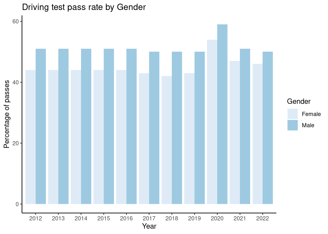
The very first thing to note from this point onwards is that to change any of the elements, it will require making your own theme.
To initialize creating our own them, use the theme() function.
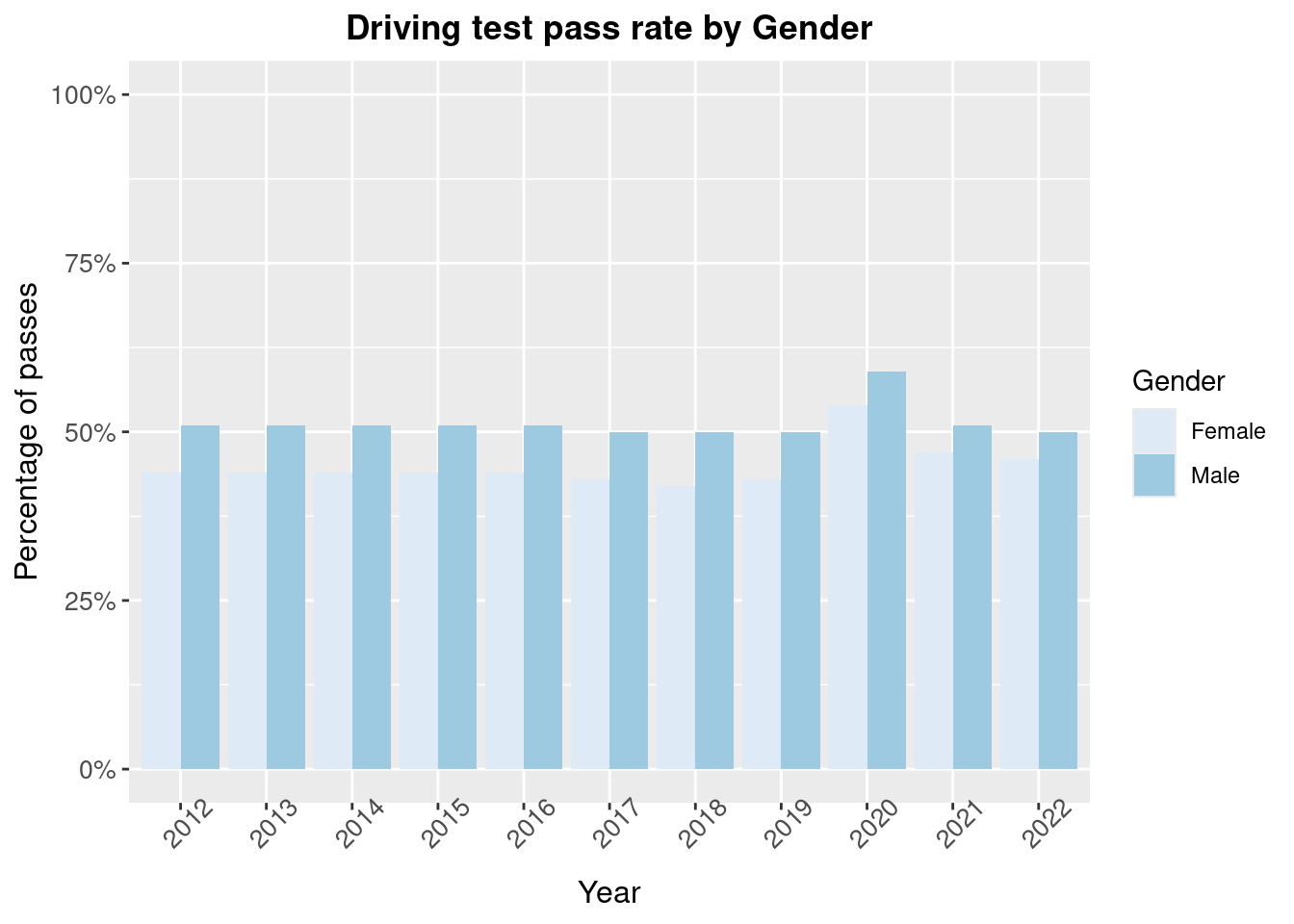
Inside the theme() function, its as simple as stating which text element you would like to change, equating to the element_text() function, and then using any parameters inside the element_text() function you’d like to alter.
Code
ggplot(driving_bar_scaled, aes(x = Financial_Year, y = Pass_rate, fill = Gender))+
  geom_col(position = "dodge") +
  scale_fill_brewer()+
  scale_y_continuous(labels = scales::percent, limits = c(0,1))+
  labs(title = "Driving test pass rate by Gender",
       y = "Percentage of passes",
       x = "Year")+

  #create theme
  theme(
        # Change size of text/numbers on the axis
        axis.text.x = element_text(size= 10, angle = 45),

        # Change size of text/numbers on the axis
        axis.text.y = element_text(size=10),

        # Change size of title on the axis
        axis.title.y = element_text(size = 12),

        # Change size of title on the axis
        axis.title.x = element_text(size = 12),

        # Change formatting of chart title, such as "Bold" or where its placed.
        plot.title = element_text(lineheight=.8, face="bold", hjust = 0.5)
  )
4.3.1 Excercise 3.2
10:00 - Change the text aesthetics, such as size, formatting, angle or placement of your #
xaxis textxaxis titleyaxis textyaxis title- chart title
- Are there any other text elements you can change? Such as the legend? Use the table above to change it.
Code
 ggplot(transport_bar_data, aes(x = year, y = usage, fill = transport))+
  geom_col(position = "stack") +
  geom_text(aes(label = transport), position = "stack", vjust = 1.8, size = 3)+
  labs(title = "Average transport modes usage over 3 years",
       x = "Year",
       y = "Usage")+
  scale_fill_brewer(palette = "PuBuGn")+

  #create theme
  theme(
   axis.text.x = element_text(size= 10),
        axis.text.y = element_text(size=10),
        axis.title.y = element_text(size = 12),
        axis.title.x = element_text(size = 12),
        plot.title = element_text(face="bold", hjust = 0.5),
        legend.title = element_blank()
  )
4.4 Changing background elements
Background elements on a plot can really help with reading a chart. For example, grid lines. Grid lines assist in improving the accuracy of data interpretation. They act as guides for reading and estimating values and minimizing errors in determining the exact position or value of a data point. One the other hand, sometimes having too much going on in the background can be distracting, especially if you have annotated charts. In that case, it would be useful to be able to make your chart background completely clear.
The element_rect() function allows you to play around with anything involving the background colours/fill of the chart, and element_line() for anything related to lines.
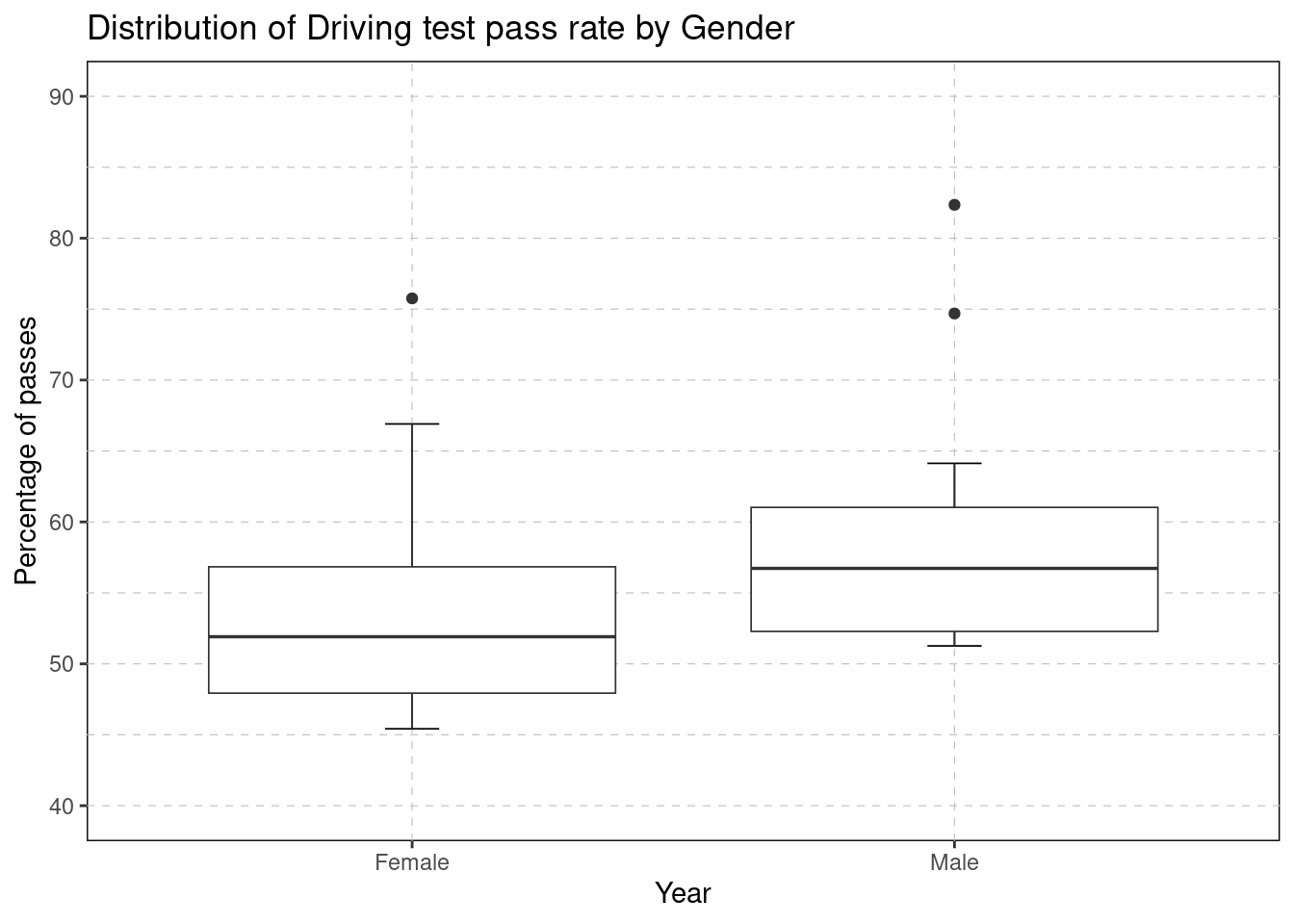
Lets look at an example of improving the background of our boxplot.
Code
pass_data_2020 <- raw_driving_pass_data %>%
  filter(Financial_Year == "2020")

ggplot(pass_data_2020, aes(x = Gender, y = Pass_rate))+
   stat_boxplot(geom = "errorbar",
               #width of the errorbar
               width = 0.1,
               #line weight
               lwd = 0.3)+
  geom_boxplot(lwd = 0.3)+
   labs(title = "Distribution of Driving test pass rate by Gender",
       y = "Percentage of passes",
       x = "Year")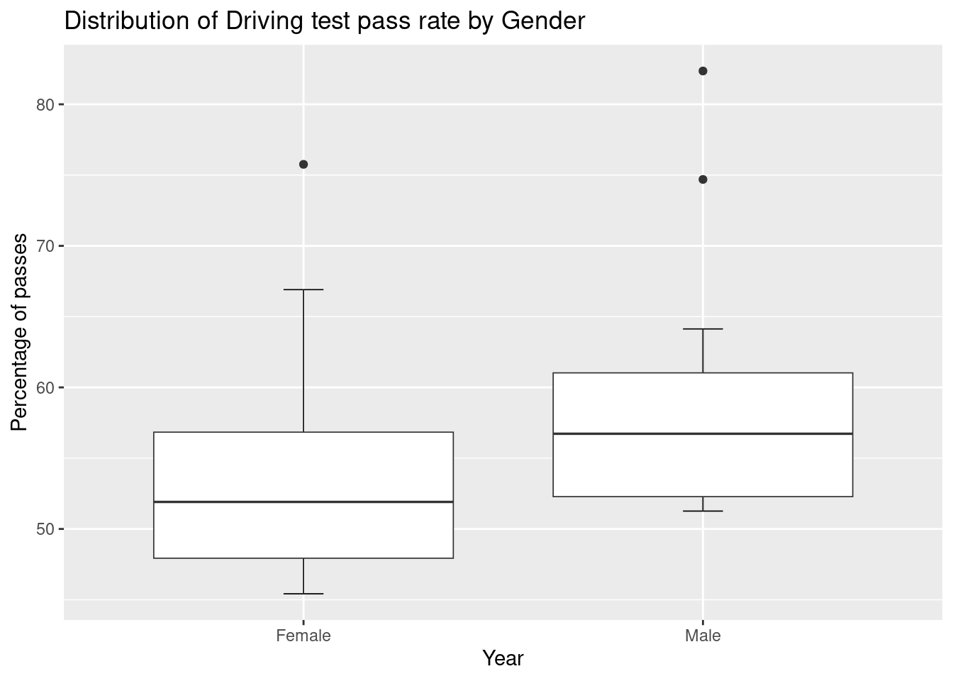
This boxplot would benefit from a plain background and horizontal gridlines to help read the distribution of pass rates between the genders. We can use the panel.background and panel.grid.major (and panel.grid.minor for grid lines in between each major line)
Code
pass_data_2020 <- raw_driving_pass_data %>%
  filter(Financial_Year == "2020")

ggplot(pass_data_2020, aes(x = Gender, y = Pass_rate))+
   stat_boxplot(geom = "errorbar",
               #width of the errorbar
               width = 0.1,
               #line weight
               lwd = 0.3)+
  geom_boxplot(lwd = 0.3)+
   labs(title = "Distribution of Driving test pass rate by Gender",
       y = "Percentage of passes",
       x = "Year")+
  scale_y_continuous(limits = c(40,90))+

  # lets create our theme
  theme(
    panel.background = element_rect(fill = "white", colour = "black"),
    panel.grid.major = element_line(colour = "grey", linetype = "dashed",  linewidth = 0.2),
    panel.grid.minor = element_line(colour = "grey", linetype = "dashed",  linewidth = 0.2)
  )
4.4.1 Excercise 3.3
15:00 - Using the boxplot you made in chapter 2, change the background and outline of the chart.
- Add gridlines to the boxplot. Play around with
linetype,linewidthand the colour of the gridlines. - Add the function
coord_flip()as another layer. What happens?
Code
ggplot(transport_bar_data, aes(x = transport, y = usage))+
   stat_boxplot(geom = "errorbar",
               #width of the errorbar
               width = 0.1,
               #line weight
               lwd = 0.3)+
  geom_boxplot(lwd = 0.3)+
  labs(title = "Distribution of transport usage levels between 2020 - 2022 compared to pre-Covid levels",
       y = "Usage % compared to pre-Covid levels",
       x = "Transport")+
  scale_y_continuous(breaks = c(0, 25, 50, 75, 100, 125), limits = c(0, 125))+

  # lets create our theme
  theme(
    panel.background = element_rect(fill = "white", colour = "black"),
    panel.grid.major = element_line(colour = "grey", linetype = "dashed",  linewidth = 0.2),
    panel.grid.minor = element_line(colour = "grey", linetype = "dashed",  linewidth = 0.2))+


  # catch you on the flippity flip
  coord_flip()
4.5 Legends
A final thing you may want to adjust is the legend.
Within the theme function you can adjust the legends:
- placement (
legend.position) - direction (
legend.direction) - title (
legend.title) - legend key size (
legend.key.size) - legend key spacing (
legend.spacing.x) - legend text (
legend.text) - getting rid of a legend altogether
- and so much more!
Lets cover how to change a the position of legend. To change the position, we use legend.positon().
There are two main ways to specify the position. The simplest way is to use one of these options - "top", "bottom", "right", "left". These options move the legend within the margin of the plot, but not inside the plot.
Another way to change the legend position is to use coordinates if you want it in a very specific position, but this doesn’t look nice.
Code
ggplot(data = good_driving_data) +
  geom_line(aes(y = value, x = Financial_Year, group = category, color = category))+
  labs(title = "Total driving tests conducted and passed tests overtime",
       x = "Year",
       y = "Total")+
  scale_fill_brewer(palette = "PuBuGn")+

  #Using a sequence function for defining y axis breaks
  scale_y_continuous(breaks = seq(from = 0,to= 800, by= 100), limits = c(0, 800))+

  #create theme
  theme(
   axis.text.x = element_text(size= 10),
        axis.text.y = element_text(size=10),
        axis.title.y = element_text(size = 12),
        axis.title.x = element_text(size = 12),
        plot.title = element_text(lineheight=.8, face="bold", hjust = 0.5),
        panel.background = element_rect(fill = "white"),

   # how to do horizontal gridlines only!
        panel.grid.major.y =  element_line(colour = "grey", linetype = "dashed",  linewidth = 0.2),

   # legend stuff
   legend.position = "top"
  )
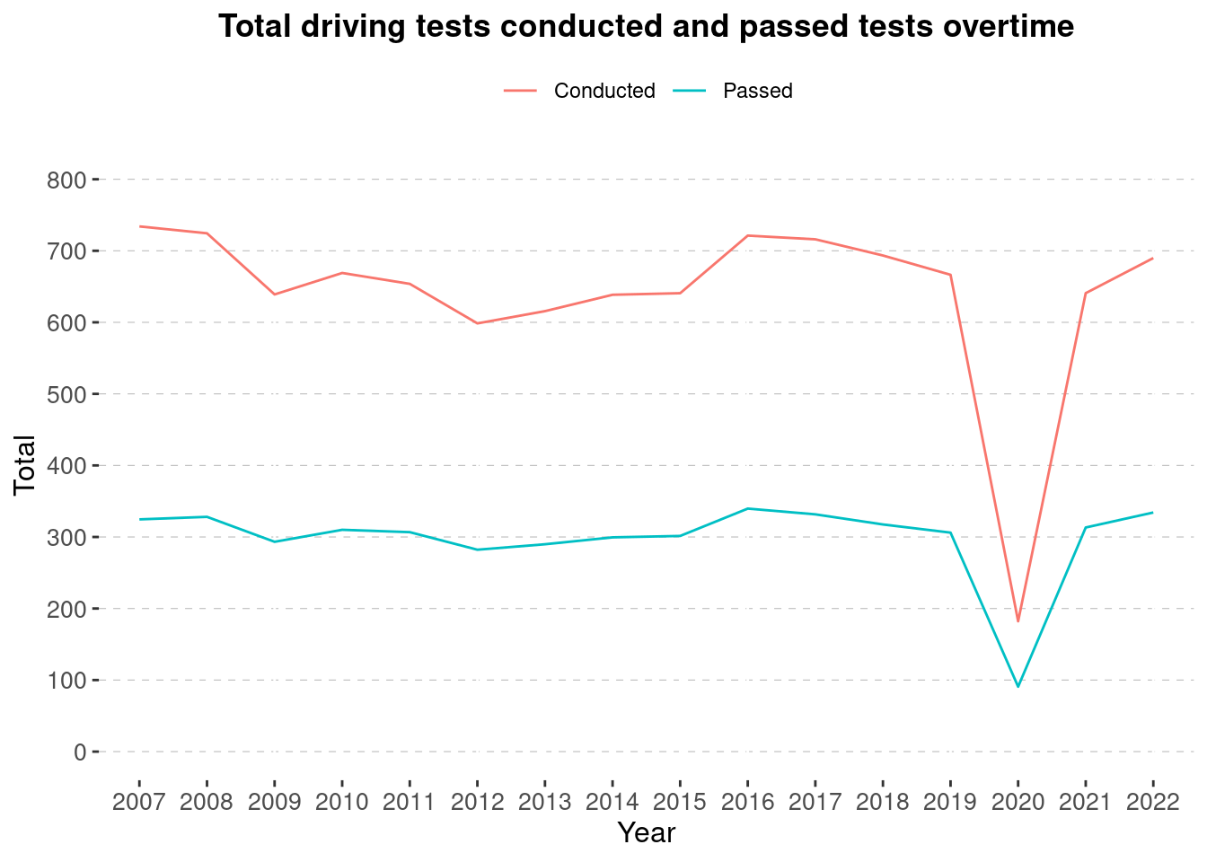
We can also remove the legend title for this chart, since at the moment the word “category” is adding no value to the chart, and sounds confusing. To remove anything, use the element_blank() function.
What if we also want to remove that little grey background around the legend keys? We can use the legend.key parameter and combine it with element.rect() to set the legend key background to white.
Code
ggplot(data = good_driving_data) +
  geom_line(aes(y = value, x = Financial_Year, group = category, color = category))+
  labs(title = "Total driving tests conducted and passed tests overtime",
       x = "Year",
       y = "Total")+
  scale_fill_brewer(palette = "PuBuGn")+

  #Using a sequence function for defining y axis breaks
  scale_y_continuous(breaks = seq(from = 0,to= 800, by= 100), limits = c(0, 800))+

  #create theme
  theme(
   axis.text.x = element_text(size= 10),
        axis.text.y = element_text(size=10),
        axis.title.y = element_text(size = 12),
        axis.title.x = element_text(size = 12),
        plot.title = element_text(lineheight=.8, face="bold", hjust = 0.5),
        panel.background = element_rect(fill = "white"),
        panel.grid.major.y =  element_line(colour = "grey", linetype = "dashed",  linewidth = 0.2),

   # legend stuff
   legend.position = "top",
   legend.title = element_blank(),
   legend.key = element_rect(fill = "white")
  )
4.5.1 Excercise 3.4
15:00 - Using your line chart created in chapter 2, add horizontal gridlines to the line chart.
- Move the legend to a different position.
- Change the legend title. Is it useful? If not, remove the legend title.
- Turn the background of the legend keys white.
Code
 ggplot(data = transport_line_data) +
  geom_line(aes(y = mean_usage, x = month, group = transport, color = transport)) +
  labs(title = "Comparing TFL Bus and TFL Tube usage in 2022 compared to pre-Covid levels",
       y = "Usage %",
       x = "Month")+
  scale_colour_brewer(palette = "Dark2")+


  #Using a sequence function for defining y axis breaks
  scale_y_continuous(breaks = seq(from = 40 ,to= 100, by= 10), limits = c(40, 100))+

  #create theme
  theme(
   axis.text.x = element_text(size= 10),
        axis.text.y = element_text(size=10),
        axis.title.y = element_text(size = 11),
        axis.title.x = element_text(size = 11),
        plot.title = element_text(lineheight=.8, face="bold", hjust = 0.5),
        panel.background = element_rect(fill = "white"),
        panel.grid.major.y =  element_line(colour = "grey", linetype = "dashed",  linewidth = 0.2),

   # legend stuff
   legend.position = "top",
   legend.title = element_blank(),
   legend.key = element_rect(fill = "white", colour = "white")
  )
4.6 Make your theme an object
To use your theme repeatedly on different charts, you can assign it to an object, and then add it as a layer.
Code
 my_theme <- theme(
   axis.text.x = element_text(size= 10),
        axis.text.y = element_text(size=10),
        axis.title.y = element_text(size = 11),
        axis.title.x = element_text(size = 11),
        plot.title = element_text(lineheight=.8, face="bold", hjust = 0.5),
        panel.background = element_rect(fill = "white"),
        panel.grid.major.y =  element_line(colour = "grey", linetype = "dashed",  linewidth = 0.2),

   # legend stuff
   legend.position = "top",
   legend.title = element_blank(),
   legend.key = element_rect(fill = "white", colour = "white")
  )
And now add it you any plot like this:
Code
 ggplot(data = transport_line_data) +
  geom_line(aes(y = mean_usage, x = month, group = transport, color = transport)) +
  labs(title = "Comparing TFL Bus and TFL Tube usage in 2022 compared to pre-Covid levels",
       y = "Usage %",
       x = "Month")+
  scale_colour_brewer(palette = "Dark2")+
  scale_y_continuous(breaks = seq(from = 40 ,to= 100, by= 10), limits = c(40, 100))+
  my_theme
4.7 Using the dftplotr package
Now that you know how to create your own theme, you may also find it very useful to know there is a serires of DfT themes available. You could even use the topics explored above to adapt the DfT themes to meet your visualisation needs.
dftplotR is an R package to provide standardised charts formatting in ggplot2. It includes theme functions which meet Government Statistical Service (GSS) best practice guidance. It also includes colour palettes based on DfT corporate branding which meet WCAG 2.0 accessibility standards, and are distinguishable in greyscale. The package is under review and continues to be developed to add more features and review things like the colour palettes, but its super-okay to use for now!
Once the package is installed, you can simply apply the pre-made themes and colour pallettes to your chart, just as you’ve done earlier with the ggplot2 built-in themes.
Lets begin by installing dftplotr. Run the following in your console:
Once it has installed, load the package
The package contains the following functions:
| Function | What its for |
|---|---|
scale_colour_dft |
Applies one of a range of DfT palettes to a ggplot line chart (or other chart which groups by colour) |
scale_fill_dft |
Applies one of a range of DfT palettes to a ggplot line chart (or other chart which groups by fill) |
display_palette |
A visual output which shows all of the colours contained in the selected DfT palette |
theme_general_dft |
A standardised theme to all ggplot charts. |
theme_bar_dft |
A standardised theme to ggplot bar chart. There are options to pick other dft color palettes and top flip the x and y axis. |
theme_line_dft |
A standardised theme to a ggplot line chart. There are options to pick other dft color palettes. |
For more information on how to use this package, please follow this link: https://github.com/department-for-transport/dftplotr
For detailed help on how to use the functions in the package, use the Help page for the function. eg. ?scale_fill_dft
For our first example, lets apply an accessible colour pallette to our chart. Like before, its as simple as adding the function as another layer and specifying the pallette.
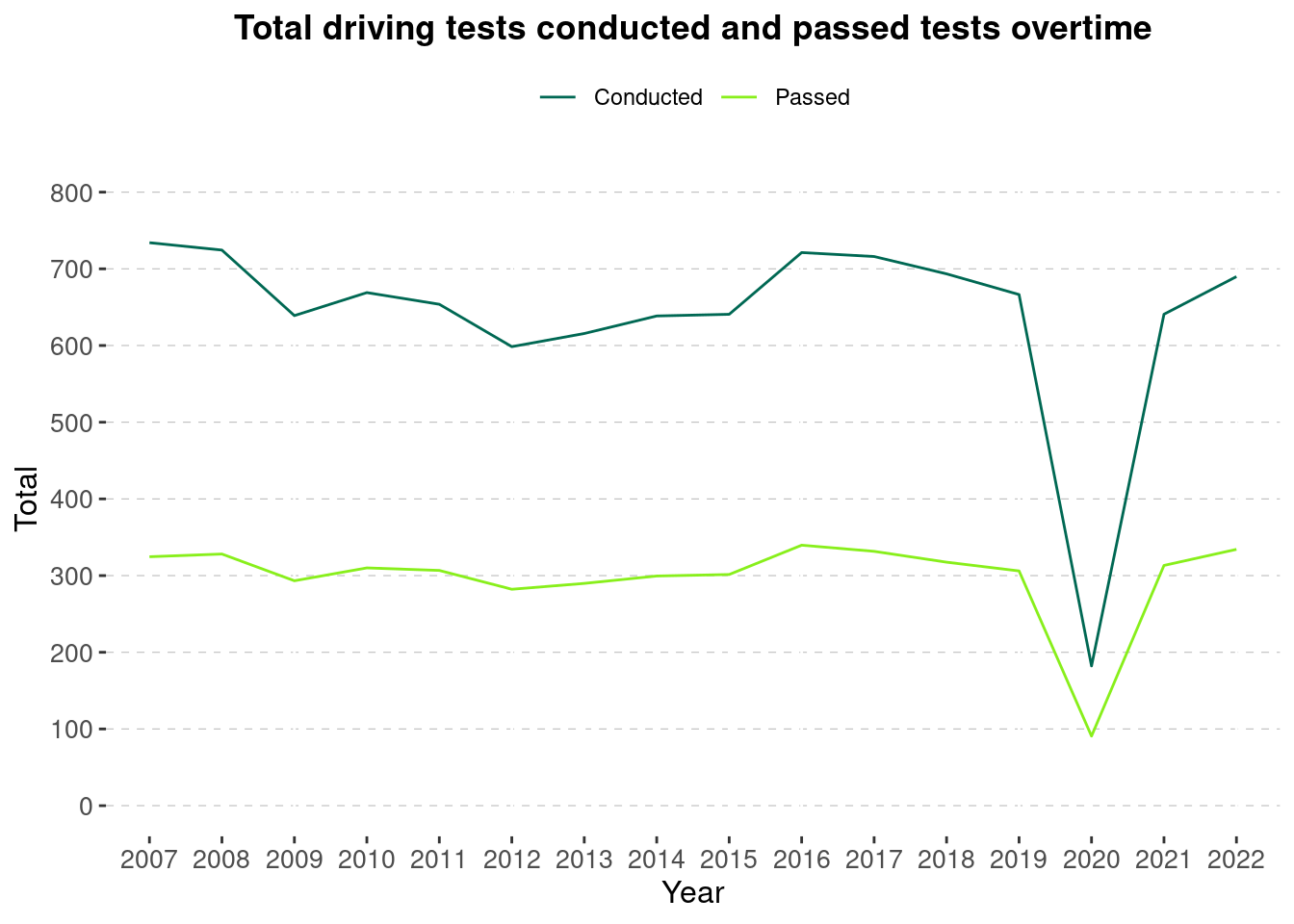
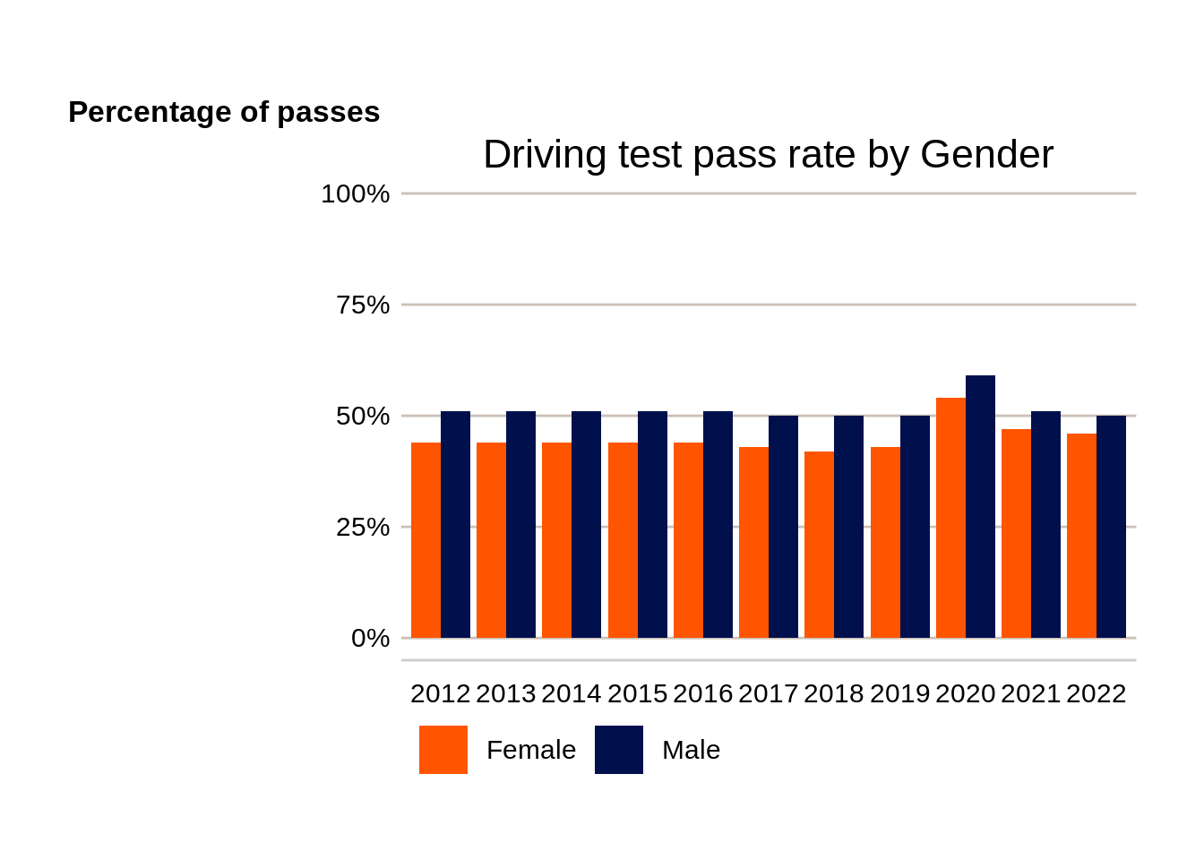
In this example, I’m applying a theme and a colour pallette to the chart from the dftplor package. Again, its just adding two layers of functions this time. One thing to take note of is that the the code works in order, hence, any previous theme arguments will be overwritten by the new theme’s arguments.
