Chapter 2 Creating plots
- Stacked bar chart
- Boxplots
- Line charts
- Scatter plots
- Scales
2.1 Stacked Bar Chart
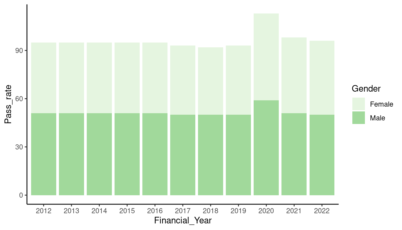
Bar charts tend to be the most common type of chart we create because they work well when comparing the size of different categories. Stacked bar charts are especially good when comparing multiple part-to-whole relationships in one chart. In the instance where a stacked bar chart is being used to represent a not part-to-whole relationship, care should be taken as it is easy for them to become cluttered and hard to read. When there are only 2 categorical variables in the data, sometimes it works better to have bars coupled rather than stacked.
Code

To construct a stacked bar chart in ggplot2, your data has to be prepared in a way that is suitable for this type of chart. In most cases, when you use a bar chart, you will have visualised categories of data. For example “types of transport” or “age range”. This means that your data frame needs to also be structured with categorical variables, and at least one numerical variable. When creating a stacked bar chart, one category in the data is used to group the bars on the x axis, and a second category is used to define the stacked variable.
This table shows the data prepped in this format for the example chart above. There are two categorical variables (Gender and Financial_Year) and one numerical variable (Pass_rate).
| Financial_Year | Gender | Pass_rate |
|---|---|---|
| 2012 | Female | 44 |
| 2012 | Male | 51 |
| 2013 | Female | 44 |
| 2013 | Male | 51 |
| 2014 | Female | 44 |
| 2014 | Male | 51 |
Once your data is ready, start by calling the ggplot() function, specify your data in the first argument, then open the aes() function and define your x and y variables. Add a geom_col() layer. So far, this will achieve a simple bar chart.
Next, we need to add some additional parameters that allow for stacking. Use the your second categorical variable in a fill parameter within the aes() function. The fill argument uses colour to create the stacks in the chart.
Finally, to transform your data into a stacked bar chart, use the geom_col() geom function, and set the argument position to “stack”. The position argument specifies how the columns should be positioned.
Code
Lastly, generally we should limit a stack to 4 categories. If you have more than 4 categories in the stack, it can get quite cluttered and may be difficult to read. Hence, it may be more useful to have your stacks labeled rather than try to match the colours off a legend. We can do this by adding a geom_text layer. Use the label argument to specify what data you would like to appear on the chart as labels, then use the position argument again to position the labels in a stacked format.
2.1.1 Exercise 1.1
15:00 The table below shows the data you will be using in the excercise. We have 2 categorical variables (year and transport) and 1 numerical variable (usage).
| year | transport | usage |
|---|---|---|
| 2020 | Busses | 39 |
| 2020 | Cars/Vans | 76 |
| 2020 | Cycling | 133 |
| 2020 | Rail | 29 |
| 2020 | TFL Bus | 43 |
| 2020 | TFL Tube | 25 |
HINT
- In a ggplot function, use the
transport_bar_datadataset to create a stacked bar chart. Plot theyearas thexaxis, andusageas theyaxis, and the remaining categorical variable as thefillparameter. - Add the
geom_col()layer and define thepositionargument. - Add data labels on the stacks using a geom_text layer. Use the
labelargument inside anaes()call to define what variable to use from the data for the labels, and use the position argument again to set the position of the labels. - Add a built-in theme to easily format the chart eg.
theme_classic(),theme_bw(),theme_minimal() - Change the colour pallette using the
scale_fill_brewer()function. Use a colour pallette from theRColourBrewerpackage.
2.2 Boxplot
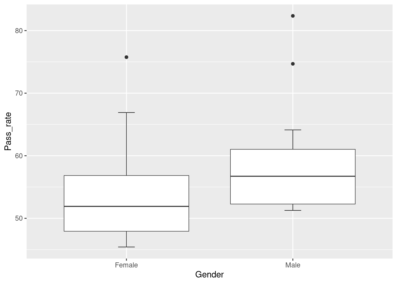
Boxplots are used to display the distribution of a dataset. They provide a quick and easy way to visualise the range, median, quartiles and outliers in a dataset. Boxplots make it easy to identify values that are significantly different to the majority of the data points because of the way outliers are indicated by points beyond the whiskers of the plot. Additionally, by plotting multiple distributions on a single plot, you can easily see the differences in the spread, the skewness, and the central tendency of the data.
To create a boxplot, prepare your data to have at least one categorical variable and one numerical variable. For our example, we are going to use the same dataset we used for the stacked bar chart.
There are a few things to consider when creating boxplots. The box and the errorbars.
Code

Begin by calling the ggplot function and setting your x and y variables. Set your categorical variable as the x variable, and the numerical variable as the y.
Unusually, instead of creating the box first, we will start off with the errorbars. This is because we want the errobars to sit under the box rather than cross over the box visually.
To create the errorbar, call a stat_boxplot() function. Inside the function, set the geom argument to "errorbar" and the width argument can be used to set the width of the errorbar.
Next we can create the box on a new layer. Using the + sign, create a new layer and call the geom_boxplot() function. You dont need to specify anything in this function, but if you wanted to play around the some formatting, you can use the lwd argument to change the line-weight.
2.3 Line Graph
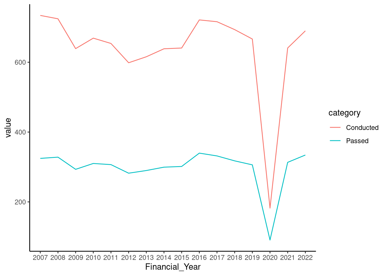
Line graphs are good for displaying trends over time or continuous variables. Its useful for comparing multiple trends, identifying patterns, showing changes over time and highlighting outliers for quality assurance through unusual trends.
To construct a line graph, ensure your data is in a tidy format. If you we want to plot multiple lines, all the categorical variables need to be in one column which can be done by pivoting columns into a longer format using tidyr::pivot_longer().
For example, if we wanted to compare the trend between mean driving tests conducted and mean tests passed using the dataset below, we wouldn’t be able to plot both lines because the categories we want to plot are in different columns. For the line graph we want to plot, there are 3 different pieces of information we’re trying to include in the plot - driving outcome/activity (tests conducted and tests passed), the values, and the years. When data is not in the correct format, one may think they can use separate functions to plot each line, like below, which in the end doesn’t work because each line overwrites the other like in the example below:
Code
| Financial_Year | mean_conducted | mean_passed |
|---|---|---|
| 2007 | 73405.88 | 32459.04 |
| 2008 | 72444.75 | 32811.67 |
| 2009 | 63901.04 | 29325.79 |
| 2010 | 66899.62 | 31002.33 |
| 2011 | 65377.46 | 30673.21 |
| 2012 | 59853.04 | 28218.83 |
Code
So lets put our data in the write format to plot multiple lines on a chart by pivoting the categories into a column of their own.
Code
## `summarise()` has grouped output by 'Financial_Year'. You can override using
## the `.groups` argument.| Financial_Year | category | value |
|---|---|---|
| 2007 | Conducted | 734.0588 |
| 2007 | Passed | 324.5904 |
| 2008 | Conducted | 724.4475 |
| 2008 | Passed | 328.1167 |
| 2009 | Conducted | 639.0104 |
| 2009 | Passed | 293.2579 |
Now we plot.
To plot data on driving tests conducted and driving tests passed is now pretty simple.
As usual, begin with the ggplot function and assign the data you would like to use. This time, we’re using good_driving_data. Then add a new layer and use geom_line() transform your data into a line graph.
Next, in the aes() function, since we want to observe the data over a span of time, we assign Financial_Year to the x axis, and values column to the y axis. To plot our third piece of information which is the 2 categories we’re interested in, we set the group argument in the geom_line() function as "category". This tells ggplot to identify the different the groupings in the category column in the data, and plot them separately. You can also use the colour argument to give your lines different colours to eachother if you find it useful.
Code

2.4 Scatter Plot
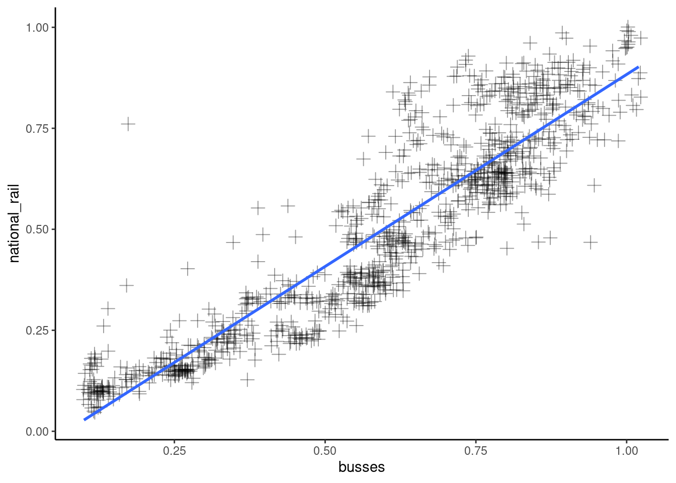
Scatter plots are quite simple to create since it involves plotting only 2 numerical values.
We begin by specifying our data in the ggplot function. We are using the raw_travel_data as our variables exist in separate columns in this dataset.
| date | weekday | cars | light_commercial_vehicles | heavy_goods_vehicles | all_motor_vehicles | national_rail | tfl_tube | tfl_bus | busses | cycling |
|---|---|---|---|---|---|---|---|---|---|---|
| 2020-03-01 | Sun | 1.03 | 1.11 | 1.08 | 1.04 | 0.95 | 1.04 | 1.02 | 1 | 0.89 |
| 2020-03-02 | Mon | 1.02 | 1.06 | 1.03 | 1.03 | 0.95 | 0.95 | 0.97 | 1 | 0.89 |
| 2020-03-03 | Tue | 1.01 | 1.05 | 1.02 | 1.02 | 0.95 | 0.95 | 0.96 | 1 | 0.89 |
| 2020-03-04 | Wed | 1.01 | 1.04 | 1.03 | 1.01 | 0.96 | 0.95 | 0.97 | 1 | 0.89 |
| 2020-03-05 | Thu | 1.00 | 1.03 | 1.02 | 1.00 | 0.96 | 0.92 | 0.92 | 1 | 0.89 |
| 2020-03-06 | Fri | 1.02 | 1.03 | 1.02 | 1.02 | 0.99 | 0.92 | 0.96 | 1 | 0.89 |
Since the x and y variable is all thats needed for plotting a scatter plot, we could add the geom_point() layer and leave it there. But, there some useful arguments worth exploring for scatterplots.
Shapeallows you to choose a different marker to plot your data. There are 25 shapes to choose from.Sizelets you choose the size of the point.Jitterin thepositionargument spreads your points apart a little if there are too many overlapping eachother.
Alphasets the transparency of your points. This can be useful when there are lots over overlapping points that are clumped together.Colourlets you set the colour of the points
Another useful layer for a scatter plot is a line of best fit which we can add using a geom_smooth() function. On its own, the geom_smooth() function will create a smooth line through the points, but to create a straight line, we use the method argument and set it to "lm", and "se" to FALSE. "lm" stands for linear model, and "se" set to false suppresses confidence intervals.
Code
## `geom_smooth()` using formula = 'y ~ x'